Spent the afternoon exploring pastel colour on coloured paper:
1) using colour patches on a mid green background paper with a parallel set of colour patches on a white background
What a huge difference the green paper makes to the apparent intensity of the colour patches compared to those I did on the white paper.
2) I then repeated the same systematic use of colour patches but used complementary colours on a terracotta/ ochre coloured paper. Again this made a difference but it also depended on the colour hue used and tended to be predictable. ( results in sketch book )
What have I learned?
To ask my tutor if I have an important Q ( he said to explore all this when I asked if I would find it helpful). Boy did I find it helpful and will continue tomorrow.
That background colour with/ can/ may significantly enhance the colours/ tones used
Before undertaking a colour study, do some colour pairings etc
Next steps
Must look for 'ghost colour'
- Posted using BlogPress from my iPad
Wednesday 16 November 2011
Tuesday 15 November 2011
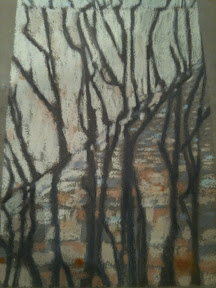
Explored the work of several artists re vertical structure composition
Looked at works such as those of Rose Hilton, Ivon Hitchens, and others ( copies in sketch book) to see where two vertical lines work well for the main structure in their paintings. Rose Hilton uses this composition a lot for her interiors, views outside, painting from Life Drawings and Still Lifes.
Often the colour of the vertical components is used as a motif through the painting as in drama or music.
- Posted using BlogPress from my iPad
Often the colour of the vertical components is used as a motif through the painting as in drama or music.
- Posted using BlogPress from my iPad
Thursday 10 November 2011
Turps Bananas
Subscribed to the online version. Really interesting - especially reading about the working ideas of painters. Am taken by the narrative of working up to the final pieces as in the paintings of Peter Doigt.
Strikes me that widening my uses of media for my ideas is as important as drawing and I do get success by layering.
- Posted using BlogPress from my iPad
Strikes me that widening my uses of media for my ideas is as important as drawing and I do get success by layering.
- Posted using BlogPress from my iPad
Tuesday 8 November 2011
Studies of vertically and horizontally constructed compositions
In sketchbook, Dated Nov 8th 2011. Drawn out a DAVID BOMBERG landscape composition - to study the effect
Three Horizontal lines with echoes in tones that reflect and modulate with the strong and dynamic diagonals he is known for.
Broadly uses the 'thirds' sections but the patterning of the landscape ' latticework' creates strength and interest.
Sketch of a EUAN UGLOW painting, 'Nude with Dog' 1998, has three clear horizontal lines running through the picture with almost flat block colours.
It works as a powerful counterpoise to the angular prostrate figure linking through with the triangular shapes of arms and legs.
Having browsed through the works of Gauguin, Matisse, Sickert, and contemporary painters both landscape and portrait, it is so revealing how the subject itself demands the composition!
MATTHEW SMITH has barely any verticals and horizontal lines running through or even linking through colour because of the figurative expressiveness. DAPHNE TODD has lots of structural anchors in her portraits using windows, doors, curtains in a representational manner.
- Posted using BlogPress from my iPad
Monday 7 November 2011
Study of a Rose Hilton painting: Grey Still Life, 1998
Spent lots of time drawing out the composition of this work then undertaking a colour study so that I could see how the shapes and colours build the structure in such a pleasing way. It seems as though the artist has painted directly from the scene but is so experienced that the completed piece works so well
EVALUATION of my studies
I used pastel so the tones are not a match but It really helped to study how the colour shapes work
My pencil sketch of the structural lines and curves will help me define compositions for my work
NEXT STEPS
Do a some studies of the work of Ivon Hitchens
Re look at my paintings to see where the composition works / does not work
Take on board tutor comment that I need to see from the spectators view
- Posted using BlogPress from my iPad
Sunday 9 October 2011

Wednesday 5 October 2011
Reading break on holiday
Read 'The New Vision' Lazslo Molholy-Nagy during August. Added to my knowledge of the Bauhaus movement significantly. I learnt about the systematic program of design, function style, etc and in particular, the jettisoning of the 'decorative' by Molholy- Nagy in the pursuit of integrity, creativity and depth of vision.
How does this impact on my work and research?
More aware of the integrity of inventiveness ( and not just 'playfulness' as Waldemar Jan. notes about some contemporary art)
More intent on establishing a clearer vision and purpose for my paintings in particular.
Keener to further research colour, both theoretically and practically, to develop and improved skills
Need to prep both colour and compositional studies well before I begin painting.
Thursday 25 August 2011
Project 4: More than one view
Multi- Viewpoints
Scanning vertically, left to right
Painting from two or more viewpoints
Scanning vertically, left to right
Painting from two or more viewpoints
Project 2 and 3 Looking from one space into another
Considering light
I revisited several paintings of Sickert, The Camden Town painters and onto those interiors of Scottish colourists; drinking in the beautiful spaces created by Rose Hilton in her many paintings of interiors. In all of these there is a use of tone either muted or simply bright and expansive.
I cannot manipulate paint well yet. I can see the blends of tones that sing out - space, light and energy. Sickert produce some wildly creative brisk strokes of bright colour overlaid on muted body colour eg: 'La Hollandaise '. Tate Britain
Painting 1 of the interior built from the sketches that forced me to 'see ' the light and shadow, went better than expected. Colour selection worked well in that I was able to select useful tonal mixes to represent light and shape as well as the perspective.
A) Use of ochre at one point made a huge difference helping to foreground shape and create space, added depth by pushing back an area using paynes grey
B) the painting was better than the sketch because of the sketches done.
Looking Out.
Selection of the cold blue for the distance proved not to be such as good choice as I tried to link the interior foreground door with a more intense set of hues. painting is cold despite trying to counter this with warm contrasts. Not very successful. Also it felt like I was painting with numbers because In trying to ficus in on colour shape, I drew in a grey outline and as a result, the paint did not have a life of it's own
Representing the forms, re looking out, was more successful because of perspective rather than use of colour.
If I repeated the exercise I would make bigger fewer shapes in lighter tones and study the difference between paint intensity, space needed and do a colour study beforehand
Project 1: Some Different Views
Drawing Your Home
Looked at drawings and paintings from range of books I had ( inhibited by local library at Chester where art books are to be ordered rather than browsed as few in stock!)
Spent time studying The paintings of Sickert as I was entranced by those in Tate Britain and the many painted of Interiors.
As a result I could view parts of the house that could form a good perspective and possible range of tonal qualities.
Focused on SPACE and tried to use a good range of charcoal tone to depict what I saw, especially nearness/ distance in this period house.
Enjoyed the expression of 'looking though' in charcoal as the light from doorways and windows was interesting, creating illusion in itself.
Tuesday 19 July 2011
Reflection on my painting of Lune river edge.
Lune river edge painting. Acrylic with pastel. Interesting that I feel that this painting speaks more to the viewer than those exercises undertaken for coursework. Is this because of the focus and passion I have for personal work. I have developed in terms of colour understanding as a result of the coursework but because of the content required, my paint handling has regressed.
There are improvements in paint handling now that I have returned to using oils.
There are improvements in paint handling now that I have returned to using oils.

Tuscan patio drawing - conte, inks

Intention: to capture essence of Tuscan trees, shadow form and distance
With limited media to hand
One hour
Evaluation: would have sketched in charcoal tones to better effect
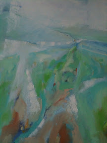
Landscape-acrylic with pastel

Striving to gain space and depth through colour
Reasonably pleased with colour shapes and pastel strokes to achieve the sense of space
Monday 18 July 2011
Sketch of landscape forms.
I intended to study the colour shapes in this gouache sketch. The
colour seemed to take over. I get a sense of movement and although I
like the sketch it us not as intended originally.
What have I learned? Planning must not overide expression in my work, but if I have an objective in mind that I do not achieve then I need, if time is available, to pursue the same objective in further sketching.

Saturday 9 July 2011

Assignment 2
Painting the interior with light coming from a window and a doorway in a corridor was pleasurable. Having undertaken a study in charcoal then painted from direct experience, I found that painting in four hours easier than I believed and kept me focused on tonal values. Not complete but I am not going to add to it even though there are slight tonal differenvces that I could make.
The second painting looking out from a doorway proved more difficult. Whilst I could paint tones that I wanted to describe lighter and darker re the external view, I am finding the warmth of colour tone and the interior 'darkness' although daylight, more problematic . This maybe because my outside tones are too cold. Unsure. I have one hour remaining to paint so..... Need to think and look at other paintings before I tackle it.
The second painting looking out from a doorway proved more difficult. Whilst I could paint tones that I wanted to describe lighter and darker re the external view, I am finding the warmth of colour tone and the interior 'darkness' although daylight, more problematic . This maybe because my outside tones are too cold. Unsure. I have one hour remaining to paint so..... Need to think and look at other paintings before I tackle it.
Tuesday 21 June 2011
Matisse on Why Paint?
' to translate my emotions, my feelings, and the reactions of my sensibility into colour and design, which neither the most perfect camera, even in colour, nor the cinema, can do.'
So intangible a feeling. Paint is an extension of language for me but I am not as able as a five year old painting.
So intangible a feeling. Paint is an extension of language for me but I am not as able as a five year old painting.
Research- interiors
Study of Sickert's 'La Hollandaise'. oil on canvas. 1905 Collection Peter Shand-
To the left of the viewer's eye, past the reclining nude, where the light flows from the right, the eye is drawn diagonally along the figure via highlighted paint strokes into a further interior. Tones of greens in this space are lighter than the dark wall behind the figure in the main room.
Shadows, toned in browns of vertical and horizontal shapes echo the bars of the iron bed.
Colours link though the painting deceptively, linking the areas of space and the two interiors. Note the angular shape of the highlight at the top of the step. There is even a shimmer of highlight on the door jamb. Three or four increasingly warmer brown, ochre, plus a touch of cad red perhaps add to the perspective, also reflecting the horizontal bed bars.
What have I learned? see sketch below.
How the tones and shapes describe perspective as well as the ambience of an interior,
How these strokes interlink the foreground and receding space
That the paint strokes both dark and highlights reflect those on the figure subtly
Sunday 19 June 2011
Time Out from studies
Moved house, bereeavements caused hiatus in my log
However I have managed to do some sketching and painting during May and June. returned to normal now!
However I have managed to do some sketching and painting during May and June. returned to normal now!
Inspiration from Fine Art degree show
Viewed the Manchester Uni Fine Art show which included painting. Amongst the fairly usual work and portfolios, there were two outstandingly beautiful and thought provoking painters. One painted portraits in water colour using minimal strokes, delicately powerful in execution. Awarded annual prize.
The second painter - in oils, was phenomenal . Her series of images in operating rooms demonstrated huge creativity, technique and ambiguity. Placed both works in mind and kept catalogue. this second artist has recognition at BP Nat Portrait Award this year with a portrait in renaissance like glazes. Clearly her conceptual, technical and creative talents are to look out for in the future
I noted the smoothness and precision of paint
No redundant paint strokes
Opacity where needed
Perspective often hinted at rather than overly drawn
Tonality used sparingly as is perspective to create space, depth, and a sense of spirituality or universal in scope
Emotional impact to the viewer is massive,
The images promote questions, searching, are tantalisingly ambiguous
Research and drawings are very evident in pre work so one can track the idea developments
Often the choice of colour counters expectations - ie blue mass in foreground. Red shelters behind a black band to keep it
Tuesday 31 May 2011

Friday 21 January 2011
Landscape with barn pastel sketch

Really enjoyed sketching with pastel strokes over washes of gouache


Monday 10 January 2011
Painting Objects in an Interior
Lost the passion for paint during this work and had to kickstart my painting by assuming the stance that I was painting it for me. Did manage to breathe fresh life into it. Think that the lack of a tonal sketch for the interior as background limited my support for painting rather than the drawing of perspective. As a result it felt like an exercise
Felt that I got some balance of exuberant colour and accuracy but also the need NOT to complete the painting when statement is reasonably complete. nevertheless the colour studies, I find invaluable now as is research into how artists paint 'contrasts of space' using contrast and harmony .
Have learned also the essential nature of paint opaqueness . Still not confident in using acrylic though and will change to oils soon.
Saturday 8 January 2011
Digital sketching
Playing with colour, tone, marks and shape using digital technology is exciting and liberating. One is able to react to the stimuli spontaneously, modify with speed and capture essences, albeit with limited palette and tool. Ones eye is focused and hands channelled to 'paint' or sketch with less baggage , more purity.
Page 1 of Document "Plan for assessment jan11"

Tuesday 4 January 2011
Subscribe to:
Posts (Atom)