Well on the way with this subject though still pondering the composition whilst trying to balance accuracy with exuberance in colour. Have been held up by a complete incapacity to be motivated to develop this painting. Passion for it ebbing away so painting another picture for a period of time. Decided that I'll come back to it after a little time in the hope that I can see it clearer.
Studied Cezanne's 'Card-Players' where the composition is studied and re-figured at length. Fascinating to explore the different number of players, the way he handles the picture edges too (with the placement of canvas sides along one wall to anchor the structure) (see sketchbook -exhibitions)
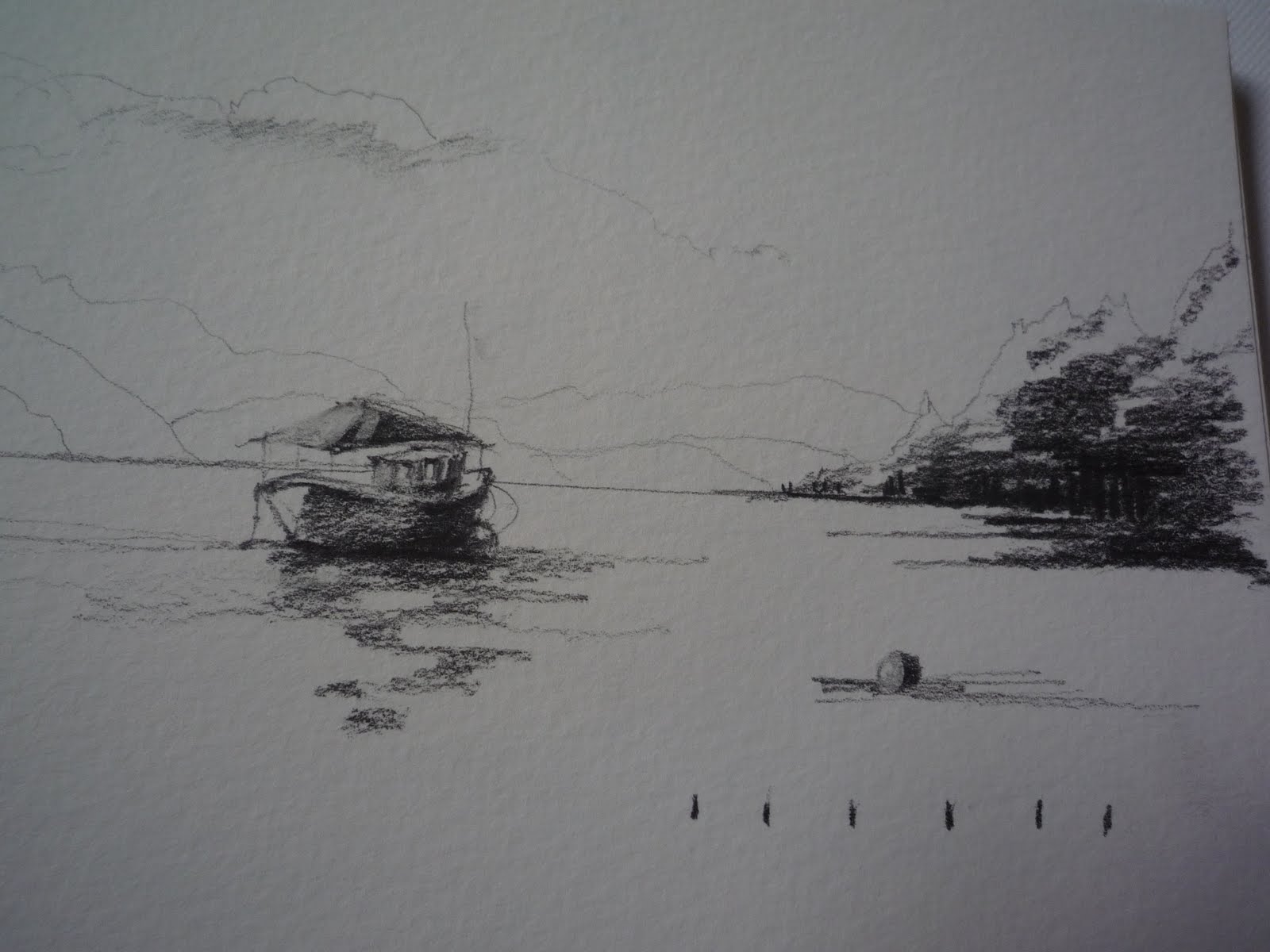
Tuesday, 9 November 2010
Thursday, 28 October 2010
Scale, Perspective & Perception
Notes: 'Eye and Brian, The Psychology of Seeing' 5th ed Richard L Gregory
Interesting comparing cultural differences. Chinese and Japanese perspective is not geometric nor is it constancy of scaling of the retinal images, like Western persepective.
Tried the 'virtual reality' notion of Brunelleschi 1377-1446 with mirror and picture against landscape. That is so interesting and it works.
Notes to remember:
'the viewer's constancing scaling is affected by depth cues'.
'we use a reduced perspective for maximum realism'
'Perspective shaped objects can upset perceptions of size and distance'
Occlusion can upset depth perception' (card trick)
''Ames' room - perception is a matter of making the best bet on the evidence'
(the objects in the room/picture/image, alter the perception) One is readily attuned to the notion of a rectangular room
Shadows - 'we judge the forms of bodies by the knowledge we have acquired of light and shadow.' (Brewster quoted in 'Eye and Brain')
'No features determine depth or form: they can only increase probabilities of seeing in particular ways.'
ILLUSIONS
'Perceptions are not always, and very likely never, directly related to physical reality'.
'Cognitive illusion depends on one's knowledge'
Four kinds of illusion categorized: ambiguities, distortions, paradoxes, fiction'
eg the mirror paradox is physical, others tend to be psychological
eg: OP Art - Bridget Riley's 'Fall' based on patterns similar to moire patterns.
'All pictures of objects are transposed in space and time'
'The intelligent eye creates hypotheses beyond visual information'
This has huge implications for the painter. If one paints visual cues, what are the hypotheses one is setting up as an informed painter aware of the knowledge wealth of the viewer.
Wednesday, 20 October 2010
Optical mixing & Inducing Colours
Stage 1 Main findings:
Lem yell with cer blue mix optically to merge into a light bright green when dots are about 1cm apart- much less occurs when the dots are wider/separate.
Ultra mar blue & cad yell:
no merging preceived despite greater/smaller numbers
Reds & yellows:
Reds & blues:
Stage 2- Inducing colours
The red cross induces a complimentary green cross shape when placed on a neutral grey background. In addition, a distinct green hue surrounds the red cross above.
Stage 3- What have I achieved?
Much improved understanding of colour definition, placement of colour(and proportional areas) and how these positively affect the viewer and other painting components.
Understand now the precise control of paint, flat opaque colour and the need to study the effects
Can mix colour with hugely improved accuracy and continuing to explore the tonal charts, and with black and white
Realise the need to re-read the text and outcome od mixing excerciese
Have more colour 'tools' to resolve painting issues
More prepared to work more fluidly and spontaneously
Different effects of colours advancing or receding
Interesting how one colour can induce another and how colours placed together look so diffferent than when separate. Looking back at problems I have had with paintings, I can see instantly some of the colour proportion issues. Need to put these Qs on my board when painting:
Is the tone right? Is it too saturated? Is the texture a problem? Is the colour too warm?
Also looking at sections of Seurat's paintings eg: the skirt edges of " Le Chahut' (The Can-Can) 1889-90
Is the tone right? Is it too saturated? Is the texture a problem? Is the colour too warm?
Also looking at sections of Seurat's paintings eg: the skirt edges of " Le Chahut' (The Can-Can) 1889-90
Tuesday, 19 October 2010
Signac - copy painting
In response to Tutor's comments I have started a copy of Signac's painting 'The Lighthouse, Saint Tropez' 1895, oil on canvas, 46cm x 55cm.
Marked out shapes in approx the same size on plywood. Interesting in that Signac paints flat colour representational shapes first then paints over in strokes of colour.
Marked out shapes in approx the same size on plywood. Interesting in that Signac paints flat colour representational shapes first then paints over in strokes of colour.
Tuesday, 28 September 2010
Sketch in gouache - Herdwick sheep Sept 2010

Started in fieldwork sketching with charcoal and 2 washes of dark gouache. kept attention with large carrots from the garden.
Finished in studio
Used handmade Indian paper for texture.
Monday, 27 September 2010
Project 2: Painting Objects in an Interior :draft
Update on this piece: Oct 5 2010.
Decided that the composition does not work so abandoned. Have done some structure drawings to improve. Problem was that I assumed that I could simply re-do the Still Life and place it in an interior. I needed to consider the distances and the colours beforehand. I could possibly repaint colours but a redraw would be best.

(Completed 7 hours of painting at this point but see above.
I need to reflect on this before I continue. Notes on what next in painting notes.)
'Art and Illusion' by Gombrich
Interesting to consider the illusory nature of paint especially when one then thinks of the works of Auerbach and Bomberg, where the paint becomes the painting -abstracting and easing away from the image. The illusion then just 'suggests' and makes the viewer work hard to 'see'.
The problem of perspective here decreases as the structure of the painting is echoed in the paint. So expressiveness and originality soars to the fore, leaving behind the core basic traditions of paintwork. As in literature, creativity though only occurs when one can transcend the basics.
Such a long way to go. Does challenge the mind set.
Pastel and gouache colour study

Image not great. Tried to capture light and dark quickly. Reasonable.
Study for painting - quick sketches

These have greater fluidity than the first go at the painting itself. Struggling with paint fluidity and freshness of brushwork
Working painting start Sept 2010

The first draft exploring paint using larger brushes -2 hours in
square in size so 'journey' area is approx 5/8
Shows starting points for painting

Structure of this attempted painting is unbalanced and the foreground is like a painting by numbers as I tried to paint the spaces in between and overdid the shapes. Abandoned it because I couldn't do the foreground with the big srokes and tonal range as I had intended.
Starting point for landscape for course

Painted at start of OCA course in response to view.
Pretty pretty painting in acrylic that has weaknesses in paintstrokes, tonal range in foreground and in the failure to decide how to bring the message to the fore. Not finished as I di not want to resort to detail in foreground but to wait until I could confidently paint foreground in particular in big brush sweeps that say something. Cad yell tried on plant but it does not work. Still thinking how to resolve whilst keeping cool harmony.
Intend to bring the idea of memory trapped in landscape via allusion. Keeping away from collage as I need to improve ways of resolving these issues first
Studies for landscape- conte
 Both sketches analysing areas for composition
Could have widened tone value but intended to gauge darker areas as this is a weakness when I prep to paint

Sunday, 26 September 2010
Painting Study board

Decided to try out using a board to help me to annotate notes, evaluations, write up next steps as well as collate colour charts as I paint. This board stands next to my painting easel at the same height and is becoming a great working method for me. So easy to do paintmarks alongside as a check and to keep a 'diary'. Love mixing tones and adding them (with a note of how mixed!) to the charts.
Can easily photo for log or paste into a painting notebook for keeps.
Red Pepper sketch

Pencil for first time for ages
Enjoyed the pleasure of using different pencils and went to buy wider range.
Tones a bit darker than image.
Highlights could be better. Improved on my attempt in 2009 when I was all over the place with charcoal.
Read in 'Art and Illusion' by Gombrich, how Constable used approx a 2B pencil for a landscape sketch then two years later he did the same scene in a darker rougher pencil. The difference is remarkable and quite exciting. But then I have to ask myself, why am I doing this when the gradations of the Masters is huge - in drawing and painting. Am I doing this is widen my skills? How does it contribute to my creativity? One cannot run before walking but for example, collage can say more in tone and message. Maybe it just adds to the repertoire and therefore contributes to creativity in the long run.
Pen sketched figure

Went to local art life class
Used pen for figure for first time
Quite like the line
Realised that did not need the tonal work to add more to sketch
Figure sketch standing

Gouache and pencil to quickly describe moving figure on Brighton beach
Model wouldn t stand for long and couldn t capture movement
Would need more tone as it became an illustration rather than a sketch though did capture head and face well
Figure -muted tones to match feeling

Used acrylic and pastel to capture mood of real figure on bench -suffering from the financial downturn
Used some collage for messages
Sketch for follow up some time
Figures sketch -tonal aim

Sketch of pear in charcoal and then gouache


Sketch drawn 1 month into OCA course followed by a gouache version to see how paintwork improved. Need to paint a new version to check on improvement. Too dark and not enough tonal variation. Not good shape. Used ochre and made it difficult for myself. Perhaps use acrylic or oils as well next then paint the drawn pepper as a challenge
Sketching in gouache - landscape

Not tonally rich but trying to capture place and expressiveness of brightness

Tonal sketches - landscapes

Light tones of tree cluster edge of Consiton -trying to position darkest tone underneath trees

Using white of paper to catch light
Monday, 20 September 2010
Moving on from the colour study
Drawing the interior is relatively easy in comparison to making colour decisions. The more I read about colour the more decisions are to be made. Also, having scrutinised another Ivon Hitchens Still Life - 'Flowers in a Vase' 1935 Oil on canvas, on a visit to Manchester City Gallery, I was intrigued by the colour selection, the proportions and the positions on the canvas. In particular, lemon yellow and dulled lemon yellow (no image located yet though I have a study in my sketchbook.) The paint marks are gestural, incredibly well positioned and there are no redundant areas of colour or brushmarks; all of them are as integral to the composition as the emerging vase, water and flowers.
I can see this and it has made me start re-defing my colour study. I need to do some small colour studies to made confident headway ... or I could just start and be intuitive.
I can see this and it has made me start re-defing my colour study. I need to do some small colour studies to made confident headway ... or I could just start and be intuitive.
Thursday, 16 September 2010
Reflection time and spontaneity
Improved use of colour mixing because I took lots of time to read and try out mixing tones. I also started another painting (not for course studies but for pleasure and to move forward using refreshed skills)
As a result I was able to spot and use tones in the colour study to resolve an area that did not work. I keep browsing the texts -Itten et al, as well as Wilcox for further support. Very valuable indeed.
Also am trying out using pieces of birch plywood as a support. Will be interesting as I have only used canvas and paper previously.
The visit to see the Auerbach really changed my use of brush and I feel more relaxed with the paint though this is tempered by practical working methods and brush sizes I use: Need to buy some larger ones from DIY (those purchased load too much paint). Using larger supports too - working on a metre by metre (for a landscape) and larger rectangles are prepared with gesso for next steps. With my personal painting, I feel almost at the point of using paint as I have in the past- with the paint marks, the areas and the meanings in space.
So what are next steps?
Course work:
- Prep a work plan so that I move on towards completing 2 assessment stages for the next sending in date (if possible)
- Prep how to organise painting notes and continuing tone charts into a usable file or notebook
- Read ahead so that resources are ready
- Set out what I want to achieve smartly before I start a project so that I evaluate against these benchmark and those of tutor.
- Upload images now that OCA has completed transfers
Personal painting:
- Visit Edinburgh to see Nat Gallery and Contem Art Gallery to scrutinise colour and brushwork of artists such as Eardley, Glasgow Boys etc and today's painters (esp to see where flat opaque colour is used with textured paint in same pieces or flat colour is used dynamically)
- start layering the recent landscape when composition is sound
- change lighting daylight source from Velux as the top down light makes less shadow.
Friday, 10 September 2010
Viewing Bomberg and Auerbach
This made a difference to my colour study start together with the Hitchens painting in the study text. I trawled my art books as well for paintings where the paintwork/colour and the proportion of area (of colour) created space but not necess. figuratively. Fascinating. I do remember trying to paint using colour shapes to do this but not as freely. More in the manner of the painter Keith Vaughn. His colours were those of 'pigeon shit' - pardon the expression but an accurate phrase.
As a result of my gallery visit and the browsing, my colour study was more spontaneous and enjoyable to do.
Next Steps:
Must re-look at colour used after short reflection time, not be tempted into detail. Big picture.
Upload image
When OCA back online, will place links from Bridgeman to remind me.
As a result of my gallery visit and the browsing, my colour study was more spontaneous and enjoyable to do.
Next Steps:
Must re-look at colour used after short reflection time, not be tempted into detail. Big picture.
Upload image
When OCA back online, will place links from Bridgeman to remind me.
My visit to Abbots Hall galleries
I couldn't paint yesterday. Was stuck. Went to see the tiny exhib of a few St Ives School painters in Kendal. It was good to see some in the flesh. But the wow factor came when I spotted the original Frank Auerbach of a nude. (perm collection of Abbot Hall) So powerful to stand back from. (Write up and thumbnails in sketchbook)
Came back and started painting. Made me more aware of the freedom that can occur with paint and brush, making the 'description' clearer and more intense than a 're-drawing in paint' effect.
Next steps:
Will paint more freely and have more colour on brush.
Will try out some large arm movements with brush on newsprint to release any tension and enjoy the paint
Will stand further back
Will browse reference colour charts as well as other painters for 'space' created by colour.
Wednesday, 8 September 2010
Wilcox Blue and Yellow Don't Make Green
What a super book for helping one to note mixing of colours. Must buy a copy. It has made a huge difference as has the Itten book.
Am in process of making own charts from this work
Am in process of making own charts from this work
Using small sketchbooks
Now I find that carrying a small sketchbook is paying off, particularly outdoors.
I need to look at the sketchbooks of artists now. Inspired to see that Henry Moore sketched the sheep in the field outside his studio. I have lots of sheep outside the window so that's a start.
I have struggled to sketch some local trees and have botched the effect but then I realised that it was the early morning shadows with the trees that say more.
Thursday, 2 September 2010
Outdoor Sketching Landscapes
Spent three 2 hour sessions with charcoal, conte and gouache, trying to distill the essence of landscapes scenes to make headway with structure and tone. Really enjoyed it and esp using new easel outside. Need to spend time en plein assessing and mixing tones. Even if just for small areas. Haven t got my act together doing this in a sketchbook.
Colour study - Still Life
Still not started the colour study but have worked with pastel and thumbnails to consider the spaces and objects. Intend to work quickly at first, largely intuitively and spontaneously in flat colour then rework harmonies and contrasts to build up colour and space. May try some texture if another 'layer' would add to the space created. If that occurs. The reflection has helped a lot.
Sunday, 29 August 2010
Making Notes
I need to be able to capture the theory in colour and notes in a manner that is usable and I can interact with each day so I have decided to do this in a painting notebook. Will place important theoretical points that underlie colour, construction concept etc here on the (b)log.
Think Time - Intensity of colour experience
Well the next project is a colour study for a painting. Instead of my usual aplomb and delight at starting a new subject, taking out the white space then lightly drawing in the subjects, I find that I am at a loss. Studying colour theory, rather than trial and error with the palette, has made a significant shift in my approach.
I am looking at the colour research, colour harmony, complimentary colour charts etc and playing with colour mixes. I keep dipping into the books re Seurat, Matisse, et al, then browsing my repertoire of catalogues of contemporary paintings too. Started pairing proportions of colour mixes on paper as well.
Not ready to start so quickly now. A classic learning experience where I've gone several steps back so that I can go forward. Maybe by Tues or Wed I will have mooted my palette possibilities.
Monday, 23 August 2010
Projects 3, 4& 5
2. Colour Theory and Practice
Having undertaken all the exercises, it becomes clear which, if not all of these need to be extended, given time. Have started a personal on-going chart of colours from own mixing, including mixing browns and greys with white or black. In addition I am contrasting them proportionally; a helpful log and reference.
Looking at some problems I have had with paintings, I can see that the juxtapositions of colour temperature/proportion of contrasting colour etc is just one of the issues. This list of Qs to ask re tone/saturation/texture/temperature is so functional.
Having said that, a glance at 'The Blue Boy' Gainsborough, alone as well as many contemporary paintings, points to the challenge !
Advancing or receding squares:
One could do without the form in a painting or let the form be governed by the colour juxtaposition as many artists do! Interesting to see the matching of saturation- a green and orange and a cerulean blue and orange. But a pale violet and orange was unexpectedly different with the orange receding. Also cad yellow with ultra blue and cad red equalised, but with a light green, it shrank a little! Yo! I need trillions of these squares. Having recently seen a painting by one of the St Ives painter: The big blue circle with a white surround buffer - need to check up the name. This poses some stunning questions and concepts.
Visited Tate summer exhibs recently and stood before the Ben Nicholson 'The White Relief' Did not understand it but have a little more insight now.
How colour can induce another:
Interesting to see how similar dots 1m apart merge with some colours and not with others. The spectrum colours used Cad Red, Cad yell, did not merge. Cerulean or a pale blue merge and at a distance some larger dots merge somewhat, as do lemon yell and a mixed pale blue, and an orange and mixed blue. Having seen this, I re-visited the work of Seurat, and some of the French painters of the period, with much greater interest and scrutiny. Must see if violet and ultra blue merge at a distance.... Would it depend on saturation and dot/space size?
Thinking back to the theory, the spectrum colours cannot 'merge' because of their wavelengths
as ALL other colours are absorbed. So they should not merge at all. Finally got hold of the Ittens, Wilcox, et al . Riveting reads. How I managed mainly intuitively in the past I don't know. Relied on studio colleagues though when stuck. We were told to 'try it out' and I did most of colour trials via monoprinting. Clearly the theory would have helped. One of my collegues painted in tiny squares most successfully so must have isolated other colour factors thereby. I would build up form via colour marks but sometimes, could go no further. I think I know why now.
What have I achieved- Project 2
Viewpoint chosen: have read a lot since I chose the viewpoint and seen several exhibitions. I would change the viewpoint now because I would re-consider the negative spaces. I think now that I have simply painted in a drawing of the subject. I did try out different viewpoints - see sketches.
In addition I would use larger brush strokes and consider when to use saturated colour and when to mix tones somewhat more. I tend to paint intuitively and the trial and error produces frustration as I want the paint marks to link in structurally rather than describe what I think is there. So why have I produced local colour. (technique limitation)
Found the 4 tones drawing difficult. The final drawing is closer to 4 tones but it took 7 sketches to get there. If I got there. Less accurate, yes but better as an initial painting study perhaps.
Ways in which artists use imagination
Typing up from paper log notes: lost online version due to wi-fi signal break up
Love Bratby's combination of 'bird's eye' view of plate, cup and cup marks with 'normal' view. Expressive colour and conytrasts of wood patterns with astute angular composition.
Matisse: La Desserte painting, 1908
Wonderful patterning dominates and structures this 'red' painting. The motifs and hues are intense and link the interior and exterior deliberately. They anchor the construction but also the playfulness. Wow.
Seurat's drawings in tone (usually in conte) : Located some books of these, with paintings too. Too late for my initial tonal drawings of still life. Why do I revert to the comfort zone of drawing in lines then am so please to capture a representation that I do not focus on the tonal elements that I need and understand? Have been taught to merge charcoal lines into tonal ranges for figure drawing. Seurat's gentle, precise tonal marks are apparently simplistic but both diffuse and round the subjects. Usually there are about 4 main tones with a judiciously placed 5th tone - as in 'Reclining Man' study for 'Bathing at Assieres'. 1883-4. (No link found) Does this diffusing, merging and separating of images make realistic drawing? Only in some single female figures I would say. The tendency to verticals & horizonals in his larger works with stylised figures in these produces optically very interesting paintings. Really interesting in the paint marks up close. In a study for 'La Grand Jatte' 1884-5, (private collection, Paris, the effect is luminescent undeniably. I think this is the contrasting hues that are layered and sometimes directional, to create the fluidity of a moving skirt.
Need to do my tonal sketches again or write this LARGE on my sketching easel!
Saturday, 21 August 2010
Project 2- from drawing to painting
I felt constrained by the square box that the objects were placed on (own choices at the time) and would probably, on setting out again, would use fabric and a larger table top although a squaring and cropping improves the composition.
With more time spent on this piece, I would try to be more confident with more succinct and larger brushstrokes
Too tightly painted as usual.

With more time spent on this piece, I would try to be more confident with more succinct and larger brushstrokes
Too tightly painted as usual.

2 further A5 Tonal sketches

Purpose: to check out viewpoints of possibly greater interest
The top version has greater depth but some lines (when I re-look at them)
Two Quick A4 Sketches - tonal still life


Rapidly drawn piece on the left, from just below eye level is closer to 4 tones, though unfinished as I knew what was wrong by then. Nevertheless, it has more energy than the others though not accurate enough to paint from. Undertaken to try out the viewpoint as is the A4 sketch on the right. (Lines present though again)
Not sure if getting there yet.
Project 1 Sketches in 4 tones, extensions

These are the other sketches
Sketch 1
My focus on drawing accuracy meant that 4 tones were not as clear as could have been. Extending one side added more interest (and the curve of the table reflected the curves on the items) but not the whole sheet was needed as the composition was then unbalanced.
Tuesday, 3 August 2010
What have I learned from painting:Still Life spaces
I haven't used the full tonal range from the three colours so far so need to re-visit after a bit more tone mixing. The background is important to me but being precious about the it does not always help the composition. Having pared down the shape of the picture, the composition is tighter. Options are: to square the picture or re-define the structure of the painting (if it were a complete painting) to anchor and develop the shapes/forms into the whole A2 space. In this case I will square the image to focus on the still life. Have learned that I enjoyed the drawing process (in this case) better than the painting because it made me consider at length. Also have learned that I need to be bolder with bigger confident brush strokes in places rather than tiddly often redundant ones.
Sketchbooks and notes Lanyon - Tate Modern visit
The layers and layers of sketches and structural drawings of the St Ives artist, Peter Lanyon amazed me in their depth of intellect, creativity and precision. Also, the media is simple - usually pencil marks. The sketches are on an entirely different level to most those of most painters because the tour-de-force of composition interpolates and carries the complex ideas and messages. Nothing is redundant in any sketch. The painting finale I was drawn towards: 'Porthleven' 1951, Tate Modern, is powerful and difficult to 'see,' more muted in colour than I expected but again hugely powerful. The abstraction from the landscape scene(s), and relationships of form and colour are precisely tuned. It astounds me. Bought book about him. Can't wait to read it. Must buy book of his drawings next.
http://www.tate.org.uk/servlet/ArtistWorks?cgroupid=999999961&artistid=1467&page=1
http://www.tate.org.uk/servlet/ArtistWorks?cgroupid=999999961&artistid=1467&page=1
Tuesday, 27 July 2010
Sketches
Event: Outdoor sketching, nr Lindisfarne NE coast
Date: July 23rd/4th/5th 2010
Activity: Brief sketches of coast in conte & pen, photos taken for ref in studio
Reflection: Like the conte light sketch of Embleton Bay and pen sketch of cliffs at Dunstanburgh castle but needed light gouache wash in areas to capture tonal ranges/ colours/ erratic patterning of cliff faces. Also needed slightly wider range of resources to try to capture the essence of the places -sky, sea in partic.
As usual, tried to draw too much - maybe too wide a sketch at times rather than reference marks and a cleaner focus in on point of interest. Not as accurate as wanted in mark making - no sandpaper with me!
Friday, 16 July 2010
Developing range of tones
Have never had enough sketches that help to scaffold my painting of landscapes in past. Have undertaken some studies in several mediums and these have helped. However I can become too 'tight' and detailed at times thereby losing the vibrancy and dynamism that attracted me to the subject/object.
Looked RA painter Ken Howard's 'Dora,summer interior, Cornwall, 2009 (Image pasted in Exhibition Visits logbook) and 'Silver still life', Chelsea, at http://www.richard-green.com/
Evaluation: counted tones and tints where light and shade is cast in partic and also looked to where the same tones and tints used throughout painting. At least 5 - 7 tones with succint, powerful and at times subtle use of contrast. Just delicious use of paint.Reminds me that the juxtaposition of tones is a key factor.
Next steps:
- draw many more objects and still subjects in sketchbook (tend to use A1 for fugures as it's effective for me) to develop tonal range so that I interpret and represent more precisely rather than rely on lines where tones would say more.
- look again at tonal range used in assignment painting after a short period of time has elapsed.
- Ask myself if juxtaposition of tones and highlights could be bettered.
Wednesday, 14 July 2010
Sketch 7

Used the side of charcoal here so more or less achieved the 4 tones. Not the most interesting sketch though.

Sketching from different angles in 4 tones
It does make a positive difference to the composition when one takes the time to reflect on angle, level and distance when selecting a viewpoint to sketch. Faster sketching does enable improved discrimination and more interesting shape(s) because I am forced to select quickly. I think this helps my hand-eye-arm agility too because I step back and look and re-look more swiftly, then match with the charcoal faster.
Sketch 1 too detailed and too many tones tight despite pulling back. Old habits and all that.
Sketch 2 diagonal angle, makes more interest. Slightly loser sketching but still more than 4 tones I think. Next steps- quicker, brief sketch?
Sketch 3 Much better -closer to 4 tones and just below eye level seems to draw viewer in well
Sketch 4 Again closer to 4 tones and fairly interesting
In two A3 sketches (5 and 6 )I have concentrated on tones to hone in on requirements more precisely with some success (where I've used tiny shapes of the darkest tone.) Have managed to veer away from detail better than in prev. ones. Next steps- must try using the sides of charcoal to achieve a tonal drawing without lines.
Sketch 7 Much better and I think I have achieved the 4 tones reasonably and I could take out the lines completely here.
Monday, 28 June 2010
Views from different angles
My idea about a bird's eye view does not add any interest further than the original sketches but from reverse side, it looks promising.
Sunday, 27 June 2010
Incorporating a slideshow?
Just wondering if I can add in my slideshow of Still Life images so that it's easier to compare compositional factors to help me decide which of my sketches is the most interesting and worthwhile pursuing.
Not able to.
Not able to.
Friday, 25 June 2010
My first still life charcoal drawing -log
 Spent some time setting up a still life to look as though it was just there and not positioned. Drawing OK but on reflection, it's too formal and not as interesting as I would like.
Searched Bridgeman and sat back to re-think. This image blows me away so I need to consider why. Why is mine mundane. Will try different angles and height next.

Thursday, 24 June 2010
Landscapes - Wennington
Having a fresh start. Going back to basics to help sort out the stops, starts and big gaps in my work.
Tried to do lots of sketches in grey tones (charcoal, pen, and in my beloved gouache ) and with big arms swirls at first to stop myself describing details and twiddy bits in paint that do not do anything positive!
Bought 3 new brushes that actual help to make the marks I want. How good is that!
Tried to do lots of sketches in grey tones (charcoal, pen, and in my beloved gouache ) and with big arms swirls at first to stop myself describing details and twiddy bits in paint that do not do anything positive!
Bought 3 new brushes that actual help to make the marks I want. How good is that!
Subscribe to:
Posts (Atom)