Drawing fluidly in stitches and letting two hands steer the thread. Like thought. Able to layer, revisit, strengthen, fade, wander..
Just line.
- Posted using BlogPress from my iPhone
Monday 26 November 2012
Thursday 18 October 2012


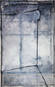
Drawing research network
Such an interesting network that validates marks and spaces, should one need that validation. I can relate to intelligent line, residual traces, signifiers of vacancy, a series of moments, the sense of an event in a drawing.
It's about a drawing language that begins to map out the intangible as it is seen through time, movement, event or interaction.
The difficulty for me is taking a photo of my work as so far my drawings are ethereal in quality.

- Posted using BlogPress from my iPad
It's about a drawing language that begins to map out the intangible as it is seen through time, movement, event or interaction.
The difficulty for me is taking a photo of my work as so far my drawings are ethereal in quality.

- Posted using BlogPress from my iPad
Thursday 4 October 2012
Evaluation of final assignment: Atmosphere
As I was in Italy with space, views and climate to paint, I decided not to paint an indistinct figure or view clouded with atmospheric paintwork but rather a painting with an atmosphere of the imaginative, possibly mysterious.
I was luck enough to stay as a guest at a castle with spectacular views across to a hilltop village. In the evenings, the staff would chase away the wild boars from beneath the garden walls so there were lots of possibilities.
I know that there is a huge difference between painting from drawings and sketches that open up possibilities and pathways but I wanted to try out a narrative painting that drew one into the painting. After all the assignment is Expressionism!
I also wanted to paint using dark tones counterpointed with the warm hues of the stones. Seems to work.
The sky part is not quite completed. Composition is fairly balanced and seems to work from all angles because of the blue brown colour intensity I think.

- Posted using BlogPress from my iPad
Evaluation of final assignment : Waterscape
This was great to do but difficult.
I aimed to capture the thrust of connecting waves and try to get the swell and depth. Having visited the Turner, Monet, Twomby exhibition at Tate Liverpool in July, I was entranced by the energy and remarkable space and depth in the Twomby wave paintings.
I manage to capture the connectedness of the wave edges, I think and some of the space, perhaps a little depth near to cliffs. A good start I hope. Will certainly paint the sea again, without twee seascapes.
Again, the warm colour ground made a huge difference to the painting. I used a warm colour ground with the blues greens and grey white of waves. Not bad. Pleased because it was difficult. Pleased because I captured a lot of what I felt and saw.
- Posted using BlogPress from my iPad

Evaluation of final assignment 2 : Townscape
This was fantastic to do, even if the result is just ordinary and very 1950s as a painting.
I just learned such a lot. This is why:
I set out with a burnt umber colour ground, studio painted, then used pastel to draw out Townscape shapes. I did get the background, foreground tones a little too close I know and with more time, I would take back the distances in tone a little as I found that the composition didn't work as strongly as I wished. I had intended that some of the verticals would have been stronger but it didnt happen. Should have kept to the thirds structure.
Because I could only carry paper this size to Liverpool docks on the train and not a board (Shoulder damaged) at least I could cut off some foreground and will reduce the sky when mounting painting to make the composition strong.
Juxtaposing colour shapes was a real pleasure! Am going to return to the Docks with an ambitious project some and hopefully sketch on the Tate upper windows.
- Posted using BlogPress from my iPad
Wednesday 3 October 2012
Evaluation of final assignment 1 : Garden
Looking back at what I wanted to achieve in this one course, I have got there and certainly widened the brief as well.
I disliked the task relating to a garden or park en plain because unless one can find a good structure in a scene, then it's not enjoyable to paint. I painted as dusk descended to see if shadows/light might be interesting. Unsuccessful. If I could find some distance and space then I would do a purely geometric painting of the hard surfaces and ignore the foliage shapes.
- Posted using BlogPress from my iPad
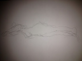
Summer sketches-Wednesleydale landscape
On it's side. Good rendition.

- Posted using BlogPress from my iPad

- Posted using BlogPress from my iPad


Painting on beach
Oil painting of figure on beach after the Scottish colourist Donald Hamilton.
Linen painting following a n earlier painting of same figure.

- Posted using BlogPress from my iPhone
Linen painting following a n earlier painting of same figure.

- Posted using BlogPress from my iPhone
Sunday 30 September 2012
Waterscape Project 4
I have really enjoyed the visual research sketching water. Because I was near the sea,I decided to take the plunge.Ha! I have never painted the sea before and it was a great challenge.
I wanted to capture the connections between the waves, the ridges that push and pull other wave along. This painting represents the strong connecting waves from the cliff edge at Point Lynas in Anglesey, North Wales.
I also wanted to paint the swell and capture a little of the depth revealed as waves lift and thrust onwards in one direction from the land.
EVALUATION
Really pleased but lots more studies needed. I need to go to the sea again. I found sketching on the edge invigorating. Interesting that my best figure drawing has been moving figures and I loved trying to capture the moving waves. Getting the right colour for space and swell was hard and I know it's not perfect.... More to do.
Friday 28 September 2012
Man Contemporary
Visited today. Loved new works at Castlefields gallery stand. Cutting edge painting refreshes the mind and aesthetic taste. Tantalisingly good.
Really strong paintings. Brushwork tasteful bizarre yet scrumptious
- Posted using BlogPress from my iPhone
Really strong paintings. Brushwork tasteful bizarre yet scrumptious
- Posted using BlogPress from my iPhone
Wednesday 26 September 2012
Painting entitled 'Wild Boar Hunt'
Not finished foreground. A narrative painting

- Posted using BlogPress from my iPhone

- Posted using BlogPress from my iPhone
Tuesday 25 September 2012
Waterscape partly en plein
Entitled ' Wave Connections' Painted on the cliff top next to lighthouse pilot jetty at Point Lynas, Anglesey. Touches of paint then in studio. Pleased. Unfinished. On its side!

- Posted using BlogPress from my iPhone

- Posted using BlogPress from my iPhone
Atmospheric drawing in gouache of Whitby Abbey
Unable to rotate. Sketched outdoors. Used paint in studio.


Thursday 20 September 2012
Drawing is semiotic notation
Read an interesting article that analyses the relationship between the range of marks made by artists, the patterning etc to nurture, explore, and visualise meaning. The product is a coherence. The article entitled" Notation is Discovery, Discovery is Notation" by John Stell, University of Leeds computing dept. Link below:
http://process.arts.ac.uk/sites/default/files/johnstelldrawingout2012.pdf
Interesting notes about the drawing marks of Whistler.
- Posted using BlogPress from my iPad
http://process.arts.ac.uk/sites/default/files/johnstelldrawingout2012.pdf
Interesting notes about the drawing marks of Whistler.
- Posted using BlogPress from my iPad
Wednesday 19 September 2012

My print of figures
In group exhibition at The Lowry Theatre area .

- Posted using BlogPress from my iPhone

- Posted using BlogPress from my iPhone
Project 1 Associations p 207 ladder and bear
14 hours- half way through project.
Hard to paint something one feels rather than sees. I do love the handling of paint and using esoteric tools.
Having chosen to go large, very large for me, the use of hands and fingers was expressive and quite emotional. It may not be for me in the long term as I like a narrative and I felt that attempts at this touch/ feel project where emotion governs, is releasing but a task rather than a love.
Have changed the palette to a burnt umber and earth colours as I don't want the objects to be too warm or overly sympathetic.
Need some acrylic thick impasto to develop the feel rather than the spacial.
Evaluation:
Better than expected so far. Uses lots of paint. Got space in it, not enough emotion or drama. needs contrasts as well as harmony.
- Posted using BlogPress from my iPad
David Bomberg
Studying his work from the Abbotts Hall Gallery, (Kendal) catalogue of the exhibition 'Spirit in the Mass' 2006 helps me to see that the balance of shape and fluidity of fresh brushwork colour is critical.
Am using his work to take a refreshed look at my landscape paintings so that I can build from a good coloured ground en plain.
Work looked at includes, 'Evening in the City of London' 1944 'Trendine in the Sun, Cornwall' 1947 and 'Farm by the Sea in Cornwall' 1948
Part of this evaluation and move forward is the confidence step to work with this knowledge of Bomberg, skills learned and emotional response to the landscape. My problem is over control. I need to use a longer brush, even if outdoors.
It would be easier to just complete in the studio but so much of the spirit of the place would be lost.
- Posted using BlogPress from my iPad
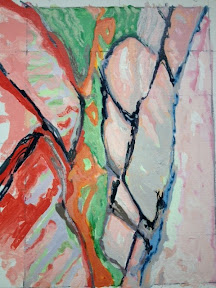
Fragmentary
I need to pursue a fragmentary piece from my work in process to see where this takes me. I like areas of the 'incomplete' where drawing or painting opens up ideas and juxtaposes the unexpected.
- Posted using BlogPress from my iPad
- Posted using BlogPress from my iPad
Tuesday 18 September 2012
Atmospheric
Finished painting of a figure in acrylic has atmospheric qualities (fronted the Student online magazine)

- Posted using BlogPress from my iPad

- Posted using BlogPress from my iPad
Painting on plein
After several forays out with prepared coloured grounds, I do like working this way BUT SEEING and structuring the work is still so essential.
What you don't get is the studies and options that emerge from lots of prep work. So profitable in opening up pathways .
- Posted using BlogPress from my iPhone
What you don't get is the studies and options that emerge from lots of prep work. So profitable in opening up pathways .
- Posted using BlogPress from my iPhone

Tuscan hilltop village
No wi fi there! Retrospective evaluation:
Painted on castle Segliano terrace over several evenings before dinner. One evening a wild boar hunt was taking place deep below in the trees and shrubs.
Have used ochre and earth colours such as burnt umbre palette. Ochre toned village used against deep dark tones of forest to get the magical effect of my favourite place. It's works to create this but it's hard to paint in darkening skies against lights of castle.
- Posted using BlogPress from my iPhone
Monday 17 September 2012
Atmospheric painting
Am enjoying this the most of all. I think it's the more imaginative elements because I've chosen a well loved place that I have a longing for. An Italian painter whose place I stayed in has told me to use linen for best work and not to compromise .
- Posted using BlogPress from my iPhone
- Posted using BlogPress from my iPhone
Sunday 2 September 2012
Project 1 Associations Pg 207
Interesting to try out coloured grounds other than those I have used eg: blue
It makes a huge difference as the optical effect is remarkable if one is careful with the later paintwork.
Having spent a lot of time looking for shapes when I draw or paint, expressive brushless painting is experiential for me. Not sure yet if I have the effect I want but I do love the feeling of the paint using fingers. I also love using a card or sponge though I prefer to be sparing with these rather than profligate!
Need to add acrylic medium to engage further with the expressive qualities of the paint than with the subject.... Must try.
- Posted using BlogPress from my iPad
Wednesday 22 August 2012
Painting outdoors
The wonderful thing about the Tuscan landscape is the patterning of the hillsides, tree and plant shapes and natural forms. A gift for an artist. One can see the shapes to paint even in the dark.
- Posted using BlogPress from my iPad
- Posted using BlogPress from my iPad
Tuesday 21 August 2012
Painting outdoors!
Great in Castagneto Carducci at the castle ! Wonder how I'll get on at home!! It's raining there again.
The light here is beautiful. Could stay and paint here forever! I am really loving painting in the early evening when kids in bed!
Am in danger of overpainting cos I have the time. Must pull back.
- Posted using BlogPress from my iPad
The light here is beautiful. Could stay and paint here forever! I am really loving painting in the early evening when kids in bed!
Am in danger of overpainting cos I have the time. Must pull back.
- Posted using BlogPress from my iPad
The Tuscan Landscape!
It's breathtaking! Soooo glad that I brought the paints and brushes with me as well as the sketchbook!
There is an amazingly huge patio here that is very high up in the landscape. And there are wild boar in the garden at evening time below the patio!
Decided to paint direct as I the owner will lend me her easel! She paints gigantic mythical creatures in a semi classical but almost Angela Carter manner. They are all over the walls.
I can leave the easel out all night !! And the evening scenes are magical!
- Posted using BlogPress from my iPad
Sunday 19 August 2012
2. Turner, Monet & Twomby
Am still stunned. To see the brushstrokes was achingly beautiful and uplifting. The Twomby series entitled Hero & Leander depicts the sea swallowing up Leander.
Each huge painting (4 in the series) moves from blackness through greens to White then a sparse but powerful leaving message in text.
But there is an astonishing sense of depth and space In each painting. The second in the series speaks of that wild yet satiated well of the sea having taken of Leander. Beautiful rhythms of whites and greens heralds with long long strokes of maybe a brush on a pole from a distance ( the how?)
- Posted using BlogPress from my iPad
A Matisse in the real!
Walking away from the exhibition, I started browsing other galleries in Tate L. In the current exhibition curated by Marianne Faithful, I spotted a favourite , the Boty painting of Monroe at the pivotal moment as the art world shifted. I just love this work. I soaked up the pleasure of seeing this astute piece again then continued.
To my astonishment, there was a small but exquisite painting by Matisse of a Nude. Early work painted in a studio dedicated to life work in Paris. It is the most interesting and perfect Life painting ! One can see the influences on later painters without a doubt. Huge range of tones intricately arranged like a symphony. What a treat!
- Posted using BlogPress from my iPad
1. The Turner Monet & Twomby exhibition at Tate Liverpool
Visited on Fri 18th Aug 2012. This I found to be a beautiful exhibition, with resonances through time, the artists' vision and techniques that revealed a shared interrogation of with light in particular.
I'm simply going to record my emotional response to these paintings because in some moments I was elated and in others, I was taken aback or intrigued.
The paintings of Monet I thought I knew well. Not so. Clearly just the illustrations! The risk taking use of colour such as Alzarine crimson with cad yellow and several green tones was startling. What was amazing was the way that these same colours resonated through the Twomby paintings AND harked back to Turner.
And I though the work of Turner was mainly browns, yellows, greens and black. But in the real, and compared to Monets, one finds oneself checking out these same colours!
- Posted using BlogPress from my iPad
Sunday 12 August 2012
Sketching on coastline in Pembrokeshire
Magical sometimes a tad hard to draw on a narrow rocky pathway above harbour where lots of folk walk. Using a 2b pencil to do simple effective lines rather than tonal to capture the rocky sweeps of the coast.
- Posted using BlogPress from my iPad
- Posted using BlogPress from my iPad
Graham Sutherland Prints
In a tiny art gallery in Porthgain Pembrokeshire, there are some stunning Sutherland prints, some of which he did as illustrations for a prestigious book on Apollinaire the French poet. They are exquisitely imaginative, and so brave in colour ! That a treat to see them.
- Posted using BlogPress from my iPad
- Posted using BlogPress from my iPad
Saturday 23 June 2012
Combined drawing and painting technique exploration
Watched video of a second year Painting student interview with her portraits in paint and charcoal. She is exploring the two and they worked very well. Cannot do the link to the ARTFUND video but it's about the summer shows June this year. Well worth a watch! Summer shows.arts.ac.uk
Good to see the interview: Elizabeth Hepworth painter at Wimbledon campus. Love her work too.
- Posted using BlogPress from my iPad
Good to see the interview: Elizabeth Hepworth painter at Wimbledon campus. Love her work too.
- Posted using BlogPress from my iPad
Hiccup! Please re-reference all Project 4 posts as PROJECT1 page 194
Just discovered this mistake on going across to my studio. Have no wi-Fi
There so I have to run across to upload! And then one gets drawn into house stuff as the man, the dog or the cat see me as a target.
So project 1- figure at a table
Have tried to relate the figure to the surrounds naturally, thought a lot about relating the colours in the painting and especially to keep it simple.
I know that I could use a wider range of tones to deepen the perspective etc also tried to sit the figure in weight terms on the chair.
Have looked at Sickerts interiors with figure again and am always stunned by the preciseness of the tones and strokes yet fresh, bold, irreplaceable marks!
No this painting is not finished and I should take it further but I need to sit back and reflect on tonality and what would move the painting on so that there are few redundant brushstrokes but well chosen ones ( and limited detail)
So what have I leaned here?
Notes and studies especially colour ones are critical for me.
My problem is too much over painting and sometimes re- selection of colour to balance etc. Getting better though as the amount of prep is carefully set out to good effect.
- Posted using BlogPress from my iPad
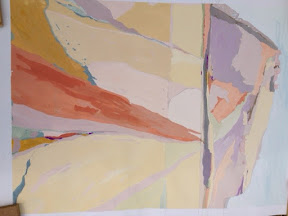
Gouache drawing of Beeston Hill landscape
Love love drawing in gouache. Could do this all day!! Such a tactile, pleasing almost comforting activity.
I need to change the foreground run of red-ochre that links into the top third. But I still like it because the colour tone shapes work well. Pic On it's side - cannot resolve this yet. Oh for my old photoshop on aged toshiba !
- Posted using BlogPress from my iPad
I need to change the foreground run of red-ochre that links into the top third. But I still like it because the colour tone shapes work well. Pic On it's side - cannot resolve this yet. Oh for my old photoshop on aged toshiba !
- Posted using BlogPress from my iPad
Project 4 How I would like to take the painting forward
Instead of painting the seated figure at a table, ( which I'm doing ) I want to take the painting / drawing studies further in a more interesting way by scoping in on parts of the work such as these below

-

Posted using BlogPress from my iPad
-
Posted using BlogPress from my iPad
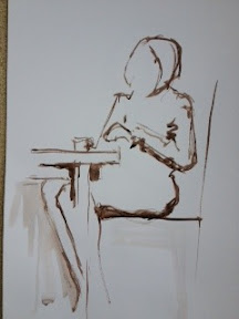
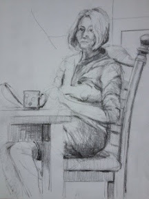
Project 4 additional studies
Scowling sister - to consider for sitter

-
Mother - studies in pencil

Posted using BlogPress from my iPad
-
Mother - studies in pencil
Posted using BlogPress from my iPad
What have I learned from project 4?
That it is better to decide WHAT information I need to prep studies for a painting where possible.
That seeing and drawing in exploratory ways using a range of media AND Mark making alongside compositional prep and tonal drawings as approp. will take the painting forward even before I begin
That I need not to be so precious as my drawing is better when fluid and looser.
That I need to learn how to use acrylic as a transparent layer.
- Posted using BlogPress from my iPad
Project 4 figure drawing /painting
Done lots of life drawings with artist Rachel Clarke in her east London studio and this experience of rapid big drawings, short bursts of kinaesthetic drawing and studies of long poses is big help.
The studies in ink and the earlier tonal work was done before all the recent contemporary drawing process work that I've done.
This study didn't add much to the painting prep at the time and this is because I didn't use draw background into the composition etc.
- Posted using BlogPress from my iPad
The studies in ink and the earlier tonal work was done before all the recent contemporary drawing process work that I've done.
This study didn't add much to the painting prep at the time and this is because I didn't use draw background into the composition etc.
- Posted using BlogPress from my iPad
Project 4
Spent an hour post an evaluation of this painting project this morning, saved it to a local draft so I wouldn't lose it if the wireless signal wavered.
I lost the whole lot.
Here is my second attempt! But I'm posting it in bite size chunks this time!
This is the first drawing in tone with pencil. Rather uncommunicative as a slightly formal dur drawing. OK as an initial prep for painting but interestingly, I did this drawing a couple of months ago and my drawing range, Mark making and exploration has wiener and improved.
I wouldn't do the same drawing as a painting prep now. I would explore line, tone, other media much more fluidly and not be precious. I would also know a lot know about what I need to do a decent painting. In fact I wouldn't do this painting ( except for this course) I would do a section, a pattern, something more meaningful!
- Posted using BlogPress from my iPad
Friday 22 June 2012
So how do I move forward following my self evaluation?
Probably do more experimental drawing as it frees the arms, hand and takes forwards the seeing process. Might do Chelsea college of art summer experimental drawing 3 day course
Not enjoying painting in acrylics though fine when using mixed media.
I cannot get fluidity with acrylics even with the added fluid medium.
Also the projects with figures ares not good for me in paint. If I could paint with Mixed media or just gouache, I would be on cloud nine. Maybe I should just do that!
I like the recommended artists sent by tutor Richard Liley and can see how the paintings work so well. My next steps are to learn how to get the transparent effect to overlay paint so that one can see the paint beneath as in These paintings ( not got names with me) will post later.
- Posted using BlogPress from my iPad
Nude drawing 2 mins left hand
First time used non drawing hand and everyone really liked the result. Tutor Paul Pickford said it got the stance delightfully. He used this and some others of mine as examples. Yes, good to capture movement. Pleased

- Posted using BlogPress from my iPad
- Posted using BlogPress from my iPad
Project 3 Using photographs. 7 or 8 hrs page 183
This was an especially interesting but frustrating project for me. Never used a photograph other than for a grouped set of figures so it felt quite odd.
It took ages to find a photo of the dimensions to scale up.
No problems scaling up and I just loved doing the prep drawings and colour study work
I chose the landscape of Morocco because this is the place and view that I liked and spent some time so I know the climate, colours, atmosphere etc
No probes with the sketches, a little with the composition because the photo was small already.
Because the task stated that one could use ones imagination freely (page185) and not to copy the photo, I felt that yes I could let the painting develop a life of it's own. But I desperately wanted to keep the first consciousness of the idea as Sutherland noted.
I got tied up with accurate up scaling from the image at first even though I know how to do it. Once resolved I painted a colour study in gouache as I fell confident that freshness is captured in this medium for me.
But I couldn't obtain the same effect or colour with acrylic so had to leave it and return some weeks later with a fresh eye!
I down scaled the image from my original plan and as a result it worked far better. However, I painted beyond the scale as seen on the painting because the dimensions worked better.
Still like the colour study better. It has the essence of the of the place even thought the green is flat. It does represent the morrocan green though not in a painting as well which is why I lifted the tone in the acrylic on board.
Good to do this work and I learned a lot. Do not enjoy work from photos though. I find them only useful as after sketch memos. No soul except in exceptional ones!
The red layer is at the base of the painting. Cannot rotate on iPad !
- Posted using BlogPress from my iPad
Drawing start of figures in a relationship
Still deciding where I want to take this. Mixed media, conte pastel charcoal graphite. But I like the feeling of abstracting to build a meaning

- Posted using BlogPress from my iPad
- Posted using BlogPress from my iPad
Drawing start of figures in a relationship
Still deciding where I want to take this. Mixed media, conte pastel charcoal graphite. But I like the feeling of abstracting to build a meaning

- Posted using BlogPress from my iPad
- Posted using BlogPress from my iPad
Recent drawings - evaluation
Some quite visually accurate pencil work in portraits that please the sitters. Not very hard to draw like this though. Harder to paint !
I like to capture a stance quite quickly as it forces me to look and draw what is the essence. This works for me and I m told I am very good at this by tutors.
Rally like taking drawing further and experimenting beyond tonal only. Am exploring lots of different media through drawing but I have a more focused intention now when I draw. Drawing without a painting in mind is visually and cerebrally stimulating
I have an Incomplete but interesting image from a photo which I will upload from Blog app. Great to decide whether to abstract, focus on rhythms,relationships of shapes or merge the figures into the background ddepending on the message I want the viewer to read.
I like the idea of figures placed in their world with an interpretation through colour and form.
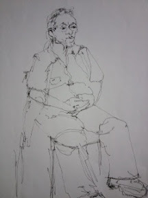
Drawings from life - on paper

Pencil 3b from model

-pencils 2,3b portraits of mother

Drawing from life - me in a mood. Pencils
Posted using BlogPress from my iPad
Drawings from other sketchbooks or on sheets - Life
This is the award pen drawing from life.

Ten min figure sketch in pen from life

- Posted using BlogPress from my iPad
Ten min figure sketch in pen from life
- Posted using BlogPress from my iPad
Drawings from other larger sketchbooks - Life
Life and portraits from classes. Have done lots and lots of drawing from life classes over many years but recent contemporary drawing classes have taken my drawing further because of the spontaneity and flexibility promoted.

.10 min life pen sketch awards best drawing prize at Lancaster University
Life class
Ten min seated drawing from life

15 min life drawing in charcoal
- Posted using BlogPress from my iPad
.10 min life pen sketch awards best drawing prize at Lancaster University
Life class
Ten min seated drawing from life
15 min life drawing in charcoal
- Posted using BlogPress from my iPad
Project 1 painting from working drawings 7 hrs
This work began in Feb following previous tutor report but because the tutor found my log hard to follow, I am simply making further evaluative comments to add to earlier blog
I enjoyed this project work, and especially line drawing and the colour studies which helped me to work out what worked reasonably well.
Briefly, I focused in on an outdoor scene and used a section of my photo.
Looked carefully at Sickerts paintings of which I have a great book. What I find interesting is that some artists part from original drawings and Sickert sticks to drawings
I made a tonal study with focus on shape and the relationships between these and the resulting forms in particular.
Was looking for these elements in particular and the need to concentrate on colour - to interpret it vividly as noted on page 174
Although I enjoyed the process, the first flush of the painting with reverse tonality worked better than the final painting result.
I learned such a lot from this painting prep though. In particular, to sort out the colour and tonal range really well and keep to the dynamic refreshing frost flush of paint!
Knowing how to increase the sizes proportionally is a real help too.
- Posted using BlogPress from my iPad
Project 2 Developing a shorthand page 177- 7 or 8 hrs
In the past I haven't made colour notes made that have been useful but this time, maybe because I was more focused, they really helped together with the numbered tones.
I think this was because I had a painting in mind. Chose a Sunday morning newspapers and tray on the bed quilt!
Having made too many tonal notes in the past, to no specific end, I kept these simple and focused on the shapes and knew that I couldn't refer back to the scene as the task set out.
No shading used in the drawing and oh my goodness this really helped! Numbering tones made me LOOK and SEE more precisely. Loved doing this process. Did a tad shading for crease around tray but the emphasis on the shapes and forms with the numbered tones worked so well in teaching me the HOW and adding to my repertoire.
So, the pattern and rhythms came to the fore rather than me struggling with the colour proportions as I usually do.
No it's not a great painting but it taught me to select and the correspondence in size from drawing to painting was a solid learning opportunity for me. I used paper as I felt it was an exercise and didn't want to be precious.
I kept the paint statement simple and it worked much better than usually.
Can translate colour shape into paint better now and I have learned how to prep drawings for painting in profitable ways.
I know that the paintwork is harsh and incomplete but it tells a good story of the learning process for me so I need to keep the end result as it is now.
I will be able to move paintings on more quickly and successfully now because I have these prep skills
Pleased with the process definitely! Might do another version on canvas but smaller.
- Posted using BlogPress from my iPad
Thursday 21 June 2012
Drawn hands - 'Emulsion' print
Interesting way to develop an idea using ordinary resources!
Drawn with a stick, printed with White emulsion, over washed with Indian ink then rinsed in water.

- Posted using BlogPress from my iPad
Drawn with a stick, printed with White emulsion, over washed with Indian ink then rinsed in water.
- Posted using BlogPress from my iPad
Contemporary drawing with print with tutored group
Using earlier life drawing of a moving nude, I did an 'emulsion' print with Indian ink and fresh drawing on foam card with a new drawing in oil pastel as a layer.
Interesting results that triggered ideas for developing the theme and taking it forward.

- Posted using BlogPress from my iPad

Interesting results that triggered ideas for developing the theme and taking it forward.
- Posted using BlogPress from my iPad
Sunday 17 June 2012
Evaluation of painting recently
Haven't enjoyed painting at all this year and lost my passion. This is mainly because I find the subject matter or probably my interpretation of the project subjects, uninspiring. Yet I am very inspired when I see paintings in exhibitions and watch artist work. Instead of working at how to inject some passion for the form and indeed acrylic paint, I just put my head down and did the tasks whilst trying to 'do my own painting on the side'
It didn t work. In fact I did some of the worst paintings I have ever done even though I have a degree in art and have inspected art in schools for years. So I have had to ask myself why?
Here's my reflection
I chose the wrong course because I thought I would need the scaffolding of deadlines and some theory re colour.
I realise that I need to work with other artists as is evident from my work in workshops
Process work is strong when I work in an exploratory way and widen media use even if discrete , such as print work
I dislike using the plasticity of acrylics on their own and work well in a mixed media painting environment
The electronic log is OK but limited in a tactile look- back way so I tend to use my own folder of things, ideas and images that I might use later.
So what's next? How do I trigger an impetus and redirection? See next post
As I do not want to lose text so far.
- Posted using BlogPress from my iPad
Thursday 14 June 2012
Left handed rapid drawing of standing nude.
Just loved the fluidity and delicate nature of this drawing and the tutor again picked this out as a good example ( and the other two!)
Drawing this way adds such an integrity to the outcome as the eye rather than the presumptive hand dominates.
Not a good image as weather and light poor. Again, I cannot rotate the image.
- Posted using BlogPress from my iPad
Drawing this way adds such an integrity to the outcome as the eye rather than the presumptive hand dominates.
Not a good image as weather and light poor. Again, I cannot rotate the image.
- Posted using BlogPress from my iPad
Longer pose of seated figure. (nude)
Actually the time was around 12 mins! Worked quite well and reasonably pleased.
Cannot turn photo around with iPad blogger!

- Posted using BlogPress from my iPad
Cannot turn photo around with iPad blogger!
- Posted using BlogPress from my iPad
Drawing quickly
The previous post of the rising figure was quite a new experience though I have heard of drawing with a line this way.
Initially one almost automatically starts to draw in irrelevant details as the eye for example. Totally not needed and I realised this as I continued to draw the next two rising poses.
Tutor very pleased with the two drawings, as am I.
Why? Because these drawings say a lot to the eye and they have an energy and freshness about them.
Tutor said that the spontaneity of the work will feed into a 'usual' Life drawing.
Drawing a figure rising slowly
Swift drawing to get the whole figure posed for a minute before lifting in five upward poses.

- Posted using BlogPress from my iPad
- Posted using BlogPress from my iPad

Drawing a walking figure
The purpose was to see if one could capture the motion and to extend the drawing experience, trigger fluidity of pencil use. Worked a treat for me as I have been experimenting often with line drawing rather than tonal. It also gives me confidence to stand and draw in the melee of a crowd, shopping place etc. Loved this intelligent Mark making.
Friday 8 June 2012
So what have I done about the outcome of my self evaluation?
Started attending more contemporary drawing sessions including Life
Booked on an experimental drawing three day course at Chelsea college of art
Bought and using Black Dog publication on contemporary drawing
Started drawing large scale and with exploratory line drawing which I just love
And what smart, measurable and active moves will I make?
Abandon paintings that I know do not work instead of doggedly continuing to complete a project
Continue contemporary drawing work alone and with others
Only paint when there is passion, purpose, lots of prep and direction
Explore and ddevelop techniques that will feed into my painting strengths
Consider whether painting is my metier or drawing, print, mixed media, all of which I just absolutely love to do.
Paint with discipline but creatively so that plastic unimaginative work does not happen
Tuesday 22 May 2012
Sketch of a landscape based on style of the artist Iden
Used gouache and intense sticks to give a print effect. Photo on it's side.

- Posted using BlogPress from my iPad
- Posted using BlogPress from my iPad
Saturday 19 May 2012
Portrait of model with artist
Having done quite a lot of sketches and substantial drawings towards the projects involving figure work, I feel more confident and the painting is going reasonably well so far.
Am finding that I work far better if swift and not laboriously because over painting deadens the painting.
Must remember to keep the whole painting going to keep balance, contrast and harmony.
Am also finding that keeping the brush strokes loose and tones and colours well matched that the visual statements are, paradoxically, more precise!
Am enjoying this work and the prep drawing ever since I have widened my language of drawing using the Mick Maslen book of contemporary drawing AND am working with a contemporary drawing group and several professional artists at The Lowry in Salford.
- Posted using BlogPress from my iPad
Painting self portrait sitting at a table
Managed to get a sense of space by distancing and cooling the colour using lemon and light mauve tones to contrast the figure. Not easy to make a simple portrait interesting. At least the painting is going reasonably well and the brushwork is fresh. I am trying not to overpaint, to keep a sense of the initial idea, not widen the colour palette too much, whilst achieving sufficient contrast.
- Posted using BlogPress from my iPad
- Posted using BlogPress from my iPad
Wednesday 16 May 2012
Contemporary drawing with a group
At The Lowry Gallery in Salford, led by a different professional artist each week. Excellent tuition. Process led with great insights Into how the artist works. Superb tips to take ones drawing further and trigger creativity!
Will upload soon.
- Posted using BlogPress from my iPad
Will upload soon.
- Posted using BlogPress from my iPad
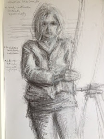
Self portrait for painting prep
Used two pencils simultaneously to draw this image, concentrated on marks that I like to redefine and say This is me.
Yes it works and is an interesting and contemporary drawing.
- Posted using BlogPress from my iPad
Yes it works and is an interesting and contemporary drawing.
- Posted using BlogPress from my iPad
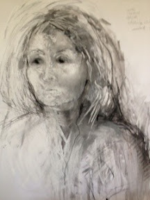
Portrait using multiple lines, conte,wash,charcoal & pastel
I think that the dynamic marks and fluid washes layer but define the image for the viewer as the eye selects line and tone to follow to engage with the portrait
Successful. Stated well but not overstated.
- Posted using BlogPress from my iPad
Successful. Stated well but not overstated.
- Posted using BlogPress from my iPad
Subscribe to:
Posts (Atom)